All manuscripts must be enlarged or reduced using computer data to copy for use.
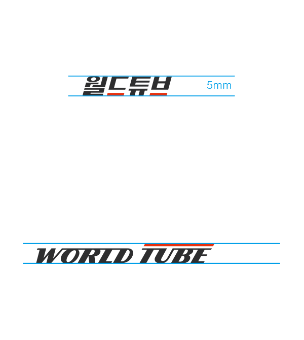
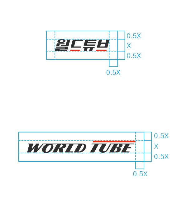
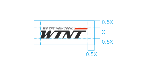
There should be a clear space around the logotype to maximize visibility and impact from other visual elements and the minimum clear space based on the height of the logotype must be maintained. The minimum size is regulated to ensure visibility and must be followed to prevent misuse of the logotype.
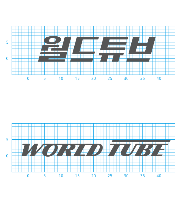
The logotype has been designed as an essential element that symbolizes World Tube.
The italic style expresses the dynamics of movements and the red line that represents passion embodies the “advancing light” and “advancing company”.


The designated colors serve an important role in conveying the image of the World Tube.
The colors serve to convey the company’s image and are actively used in promotion or marketing.
The standard color should be maintained by reviewing the printing method, the concentration of the ink, paper material, and the medium for efficient use of the designated colors.
WORLDTUBE
Dark Gray
CMYK 80/75/72/48 RGB 47/47/48 HEX #2f2f30
WORLDTUBE
Light Gray
CMYK 10/12/9/68 RGB 108/103/104 HEX #6c6768
WORLDTUBE
Red
CMYK 0/92/100/0 RGB 231/49/14 HEX #e6310e
WORLDTUBE
Orange
CMYK 0/80/90/0 RGB 233/85/32 HEX #e95520
WORLDTUBE
Yellow
CMYK 0/45/100/0 RGB 244/160/0 HEX #f4a000
